Seldom told story of model error for utility peak demand forecast…
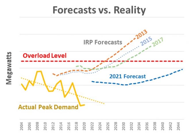
The chart shows a set of utility demand forecasts for each year of an actual IRP and each time there is model error compared to actual peak demand.
Perception of forecast error in the chart suggests the model is not that good as an indicator for future peak load and persistently over forecasts peak load.
Over forecasting peak load is like baking in additional planning reserve margin as a byproduct of the demand forecast.
Utility forecasts in the chart start with stagnation period then switch to linear increase.
It is common to find linear increase in forecast models for peak demand for IRP’s where it is not always clear if the linear increase materializes in actual demands.
In this example the utility reported actual demand is drifting down at negative growth rate.
It is noted that 2013 and 2015 utility demand peak forecasts for the years of 2012 to 2016 match well with the actual demand, however, after those years the peak demand forecast error grows considerably.
However the difference between the actual demand and prompt years of the various Utility IRP demand forecasts is separated with what appears to be a forecast of peak with upward shift.
although the utility 2021 IRP forecast seems to track actual load better in the prompt years of the forecast but then it switches to a linear increase.
Model error has been observed in more than one utility integrated resource plan process.
Model error can also come from good model approaches with bad inputs so its best to investigate before changing the model.
Over forecast of demand peaks can lead to false positive investment signals for generation and or transmission.
Will lessons learned from forecast error guide IRP’s to more accurate forecasts?
There is hope if there is willingness to question the model and inputs.
Barking dog in forrest can be heard if listened to.

